Day 4 of Australian Rail Series
The childhood game of counting wagons turns out to be an instinct shared by an entire industry — one that measures a continent-spanning network in fractions of millimetres.
The Story
When I was ten, I stood at a level crossing and tried to count the wagons on a passing freight train. One, two, three — the rhythm of each wagon passing became a game. How many before the boom gates lifted? How fast were they going? I was measuring without knowing it.
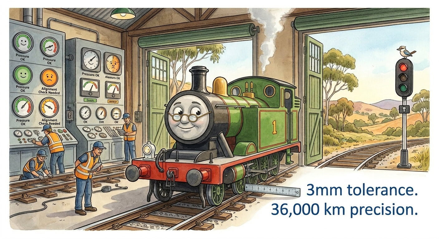
That was a child’s game. Today, the people who run Australia’s rail networks play the same game — but with instruments that measure track gauge to 3mm tolerance, rail wear to 0.1mm, and on-time performance to the second.
The surprising parallel isn’t the counting. It’s the instinct behind it: the deep human need to measure what matters. In rail, that instinct has been turned into a science. And the KPIs that emerge from that science don’t just describe the network — they govern it.
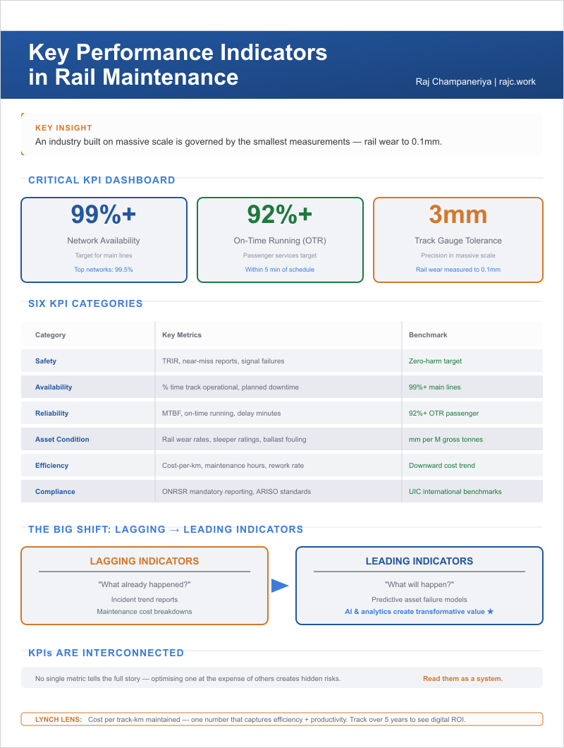
An industry built on massive scale — 36,000 kilometres, 1.4 billion tonnes of freight — is managed through the smallest measurements imaginable.
Day 4 in pictures
A few visuals for post.
The Deep Dive — 8 Questions
Why must rail maintenance KPIs be read as an interconnected system, not isolated metrics?
Because optimising one metric in isolation creates hidden risks everywhere else.
Push network availability to 99.5% by shortening maintenance possessions, and you reduce the time available for quality track work — which eventually degrades on-time running. Cut maintenance costs per kilometre, and you may defer interventions that later trigger safety incidents. Improve on-time running by skipping minor stations during disruptions, and you technically hit the KPI while degrading passenger experience.
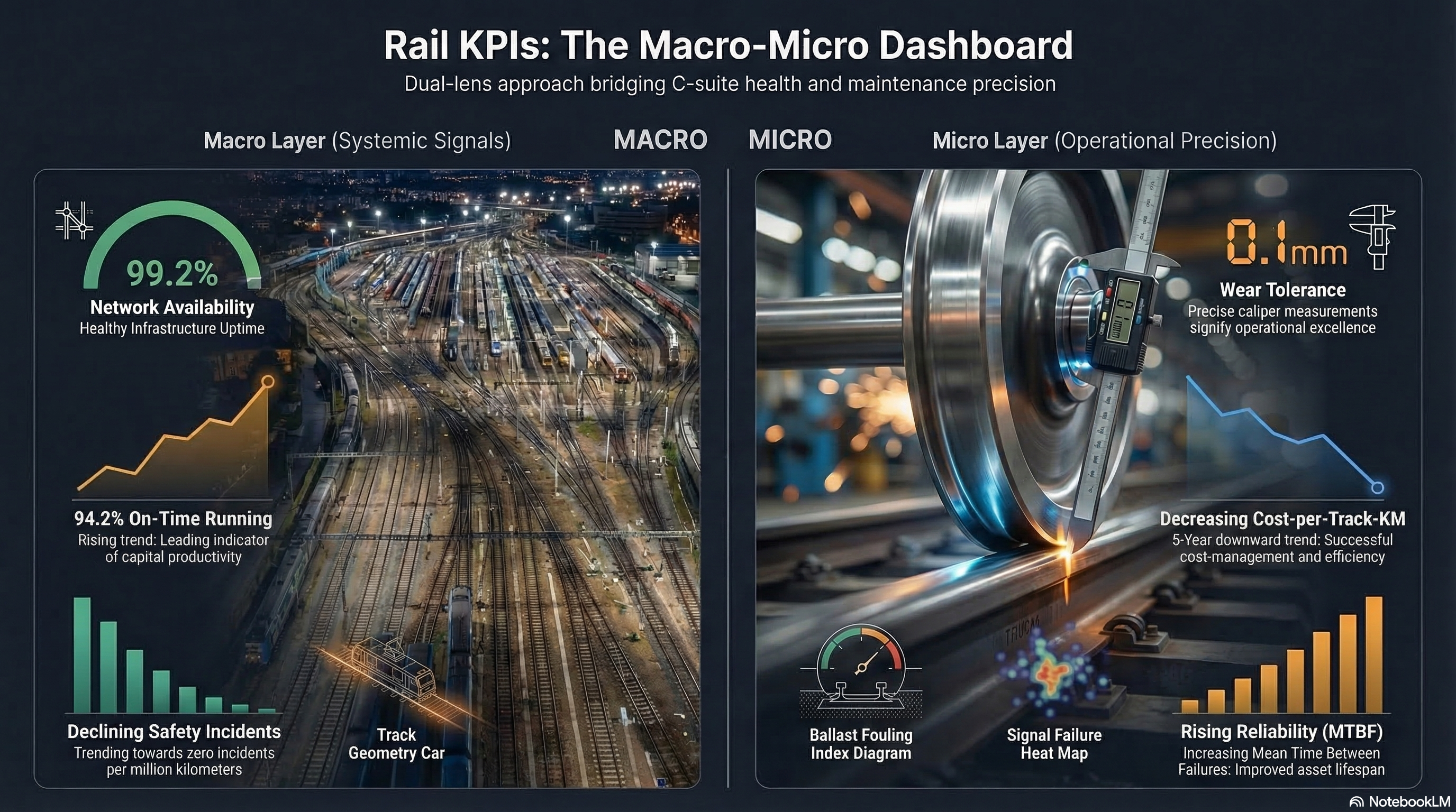
Rail KPIs form a system. The five that matter most — availability, on-time running, safety incident rate, MTBF, and cost-per-km — must be read together, like instruments on a dashboard. A pilot doesn’t fly by watching only the altimeter.
Why does a 99% availability target still allow hundreds of hours of annual track downtime?
Because 1% of 8,760 hours in a year is 87.6 hours. For a busy corridor like the Hunter Valley Coal Network, 87 hours of downtime means millions of dollars in deferred freight revenue.
Availability targets sound impressive at 99%+, but the margin matters enormously. The difference between 99.0% and 99.5% availability on a major corridor is roughly 44 hours per year — enough to complete (or miss) dozens of maintenance tasks. Operators that close the gap between 99.0% and 99.5% gain a structural advantage through better possession planning and faster maintenance execution.
How does a maintenance-caused delay ripple through an entire day’s passenger schedule?
A single track defect causing a 10-minute delay at 7:15 AM on a busy suburban line doesn’t just delay one train. It delays every train behind it. By 8:30 AM, the cascading effect has touched dozens of services. By midday, the network may still be recovering.
This cascade explains why passenger rail KPIs focus on “on-time running” across the entire network, not individual services. Sydney Trains targets 92%+ OTR — meaning no more than 8 in 100 services arrive late. When OTR drops below 90%, the political and media pressure intensifies immediately.
How does a “just culture” safety framework improve near-miss reporting rates?
If a maintenance worker reports a near-miss and gets punished for it, they’ll never report one again. Nor will anyone who hears about it.
Australia’s rail safety framework operates on a “just culture” principle: distinguishing between genuine errors (which are treated as learning opportunities) and deliberate violations (which are treated as disciplinary matters). The result is dramatically higher near-miss reporting rates compared to punitive systems.
Higher reporting means more data. More data means better risk models. Better risk models mean interventions before incidents occur — the definition of leading indicators.
How do rail wear rates of 0.1mm reveal the difference between preventive and predictive maintenance?
Preventive maintenance says: “Grind the rail every 40 million gross tonnes, regardless of wear.”
Predictive maintenance says: “Here’s the wear rate for this specific curve, at this specific axle load, in this specific climate. Based on the trend, optimal grinding is in 17 days.”
The difference is 0.1mm of insight. Rail wear measurement technology — laser-based measurement trains that scan rail profiles at speed — generates continuous, millimetre-resolution data on wear patterns. This data transforms grinding from a calendar activity into a precision intervention. The savings are substantial: extending grinding intervals by even 10% across a 5,000 km network saves millions annually.
What does a declining cost-per-km alongside rising availability reveal about an operator’s digital maturity?
It reveals that technology investment is working.
When cost-per-km trends downward while availability trends upward, the operator is getting more output from less input. This is the signature of digital maturity: predictive maintenance reducing unplanned interventions, optimised possession planning reducing wasted time, condition-based replacement extending asset life.
When cost-per-km and availability move in the same direction — both rising or both falling — the operator is in trouble. Rising costs with flat availability means spending more for the same result. Falling costs with falling availability means cutting corners.
Q7: How do Australian rail benchmarks compare to UIC international standards?
The International Union of Railways (UIC) publishes global benchmarking data that allows cross-country comparison. Australian rail performs competitively:
| Metric | Australia | UIC Average | Top Performer |
|---|---|---|---|
| Freight productivity (NTK per track-km) | High | Medium | Australia (Pilbara) |
| Urban OTR | 92–94% | 90–95% | Japan (99%+) |
| Safety (derailments per M train-km) | Low | Medium | Japan, Switzerland |
| Maintenance cost per track-km | Medium-High | Medium | Japan, Netherlands |
Australia’s freight productivity is world-leading (driven by Pilbara heavy haul), while urban passenger performance is solid but below Japan and Switzerland. Maintenance costs are higher than European averages, partly reflecting Australia’s greater distances and harsher climate.
Why does shifting from lagging to leading indicators represent the biggest KPI transformation in rail?
Lagging indicators tell you what already happened: last month’s derailment count, last quarter’s OTR percentage, last year’s maintenance spend. They’re essential for accountability but useless for prevention.
Leading indicators tell you what will happen: vibration trends predicting bearing failure, wear rates predicting rail breaks, workforce fatigue scores predicting human error. They require sensors, analytics, and a culture willing to act on warnings — not just investigate incidents after they occur.
The transition from lagging to leading indicators is where AI and predictive analytics create their highest value. An operator that can see three weeks into the future — predicting which asset will fail, where, and when — operates in a fundamentally different competitive position from one that waits for the phone to ring.
Synthesis
Rail maintenance KPIs form an interconnected system where no single metric tells the full story. Network availability, on-time running, safety incident rates, MTBF, and cost-per-km must be read together — optimising one at the expense of others creates hidden risks.
The transition from lagging indicators (what already happened) to leading indicators (what will happen) is where predictive analytics and AI create transformative value. The operators whose cost-per-km trends downward while availability trends upward are the ones getting digital transformation right.
Vocabulary Spotlight
| Term | Definition |
|---|---|
| Mean Time Between Failures (MTBF) | The average operating time between asset breakdowns; higher MTBF indicates better reliability |
| On-Time Running (OTR) | Percentage of services arriving within a defined threshold (typically 5 minutes for urban rail) |
| Network Availability | Percentage of planned operating hours the network is open for services after maintenance closures |
Micro Signal
Lynch Lens: The key micro-metric for rail maintenance is “cost per track-km maintained.” This single number captures efficiency, productivity, and resource allocation in one measure. Track it over 5 years and you see whether technology investment is actually delivering returns. The operators whose cost-per-km trends downward while availability trends upward are the ones getting digital transformation right.
In the News
Transport for NSW reports Sydney Trains On-Time Running hits 94.2% in Q4 2025 — the highest quarterly result in five years — attributed to predictive maintenance investments in signalling and track geometry monitoring.
Sources
| Type | Source |
|---|---|
| Industry | ONRSR — “Annual Rail Safety Report 2023-24” |
| Industry | ARTC — “Network Performance Reports” |
| International | UIC — “Railway Statistics Synopsis 2024” |
Tomorrow: Speaking Rail · You’ve heard “points failure” on a delay announcement a hundred times — but have you ever noticed what it actually means?